Extras
Project List
Articles
Interview: Player 2.0
Authoring for 3D Nav
ITV Design Principles
 
Origami
1000 Cranes
Paper Chess Set
|

|

|
|
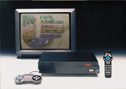
Principles of ITV Interaction Design
Early in the design of the Zoetrope interactive television applications,
I collected these seven principles of interactive television (ITV) interaction design.
I posted them on
my wall, and referred co-workers to them regularly. Making the principles
public and visible helped maintain consistency and reduce controversy through
discussions with engineers, designers and clients on both sides of the Pacific Ocean.
User tests showed that the resulting design was quite successful for consumers as well.
|
Some of these principles come from basic interaction design theory,
and some are more specific to users who are sitting on a couch
across the room from the television screen. While there are
many possibly relevant design principles, I developed this list
because these principles addressed consistent problems from the project,
and because a short list was easy for others to remember and champion.
|
|
Approach:
Interaction with a television is fundamentally different than interaction with a PC.
Many designers have created complicated, input-intensive applications for
the television.
Television watchers are looking to relax, to be entertained. A television
is watched in a "lean back" atmosphere, as opposed to the "lean forward" attitude of most
personal computer users. Also, using the remote control as an input device means that the input
is always in discrete keypresses, and the output must take this into account.
Principles:
- Give immediate visual and audio feedback to the user for every action.
- Maintain a clear focus. The user should always be able to
answer the question "Where am I now?" on any screen with a glance.
- Distinguish selectable items from the
rest of the screen. The user should be able to easily answer the question,
"What can I do now?"
- Always respond to the main "select" button. This is the most common type of input, and
the user is likely to use it as a default.
- Eliminate the need for an "error" tone. If an action is the wrong thing
to do, the user shouldn't have the option to perform it.
- Make all choices accessible with the primary navigation controls (in this case,
the 4 arrow keys & the "select" button).
This does not preclude the use of secondary controls or expert shortcuts,
but for every choice, including
"return/go back to the previous screen", there must also be on-screen navigable access.
And the catch-all principle, for anything not covered by the above:
- Make the result of every action clear. The user should never
have to think "What just happened?"
Also see interactive television portfolio projects:
Cinema No Hako |
U-Club City Guide
|
|